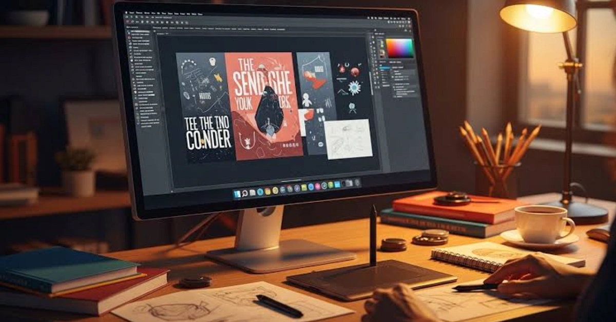
Crafting and graphic design may seem like different creative fields, but they share one important goal. Both aim to communicate an idea through visual elements. Whether you design a scrapbook page, decorate handmade signs, sew quilt patterns, or create a banner for a craft fair, strong visual composition helps your work attract attention and tell a story.
Many crafters naturally develop an eye for design through experience. However, learning a few graphic design principles can make projects look more polished, balanced, and engaging. This guide explores the visual composition lessons every crafter can apply to create beautiful handmade work that captures attention and communicates clearly.
Why Visual Composition Matters in Crafting
Visual composition refers to how colors, shapes, textures, text, and empty space work together within a design. A good composition guides the viewer’s eye and creates harmony instead of confusion.
Graphic designers carefully arrange every element to improve readability and visual appeal. Crafters benefit from the same approach because handmade projects often combine multiple decorative elements.
For example, imagine decorating a wooden welcome sign. Without planning the layout, flowers, lettering, ribbons, and embellishments may compete for attention. By applying composition principles, each element supports the overall design rather than overwhelming it.
Good composition also helps handmade gifts, home décor, event decorations, and craft fair displays appear more professional without making them look less personal.
Takeaway: Strong visual composition helps every craft project communicate its message clearly while making the finished piece more attractive and balanced.
What Is Visual Composition?
Definition: Visual composition is the intentional arrangement of design elements to create balance, movement, emphasis, and harmony.
Graphic designers rely on composition because people naturally scan images in predictable ways. Learning these patterns helps crafters organize projects more effectively.
The main building blocks include:
- Balance
- Contrast
- Alignment
- Hierarchy
- White space
- Repetition
- Proportion
- Color harmony
These principles work across nearly every creative discipline, from digital graphics to quilting, embroidery, woodworking, card making, and mixed media crafts.
Takeaway: Visual composition is simply the thoughtful organization of creative elements so viewers instantly understand and enjoy the design.
Balance Creates Stability
Balance gives artwork a comfortable appearance. When projects feel visually “heavy” on one side, they become distracting.
Graphic designers commonly use three forms of balance.
Symmetrical Balance
Both sides mirror each other.
Examples include:
- Wedding invitations
- Traditional quilt layouts
- Framed cross-stitch designs
This style creates elegance and order.
Asymmetrical Balance
Different elements balance each other through size, color, or placement.
For example:
- One large flower balanced by several smaller flowers
- Large lettering paired with decorative accents
This style often feels more modern and dynamic.
Radial Balance
Elements spread outward from a central point.
Examples include:
- Mandalas
- Wreath designs
- Circular embroidery patterns
Before adding decorations, step back and check whether the overall design feels visually even.
Takeaway: Balance helps viewers feel comfortable by distributing visual weight throughout the design.
Contrast Makes Important Elements Stand Out
Contrast creates distinction between different parts of a project.
Without contrast, everything blends together.
Graphic designers create contrast through:
- Light versus dark colors
- Large versus small elements
- Smooth versus textured materials
- Bold versus delicate fonts
- Matte versus glossy finishes
Imagine designing a holiday sign.
Dark green lettering on a dark wooden background becomes difficult to read. White lettering immediately increases visibility because of stronger contrast.
Contrast also works with materials.
A smooth ceramic ornament paired with rough twine creates visual interest through texture.
Takeaway: Contrast draws attention to important details and prevents designs from appearing flat.
Visual Hierarchy Guides the Eye
Graphic designers organize information so viewers know where to look first.
This principle is called visual hierarchy.
Large, bold elements naturally attract attention before smaller details.
Crafters can use hierarchy by deciding what deserves the most emphasis.
For example:
- Main message
- Decorative illustration
- Supporting details
- Background embellishments
If every element receives equal emphasis, viewers may struggle to understand the design.
Projects become easier to appreciate when one focal point clearly leads the eye through the composition.
Takeaway: A clear visual hierarchy helps viewers understand your design in the intended order.
White Space Is Not Wasted Space
Many beginners believe every empty area should be filled.
Graphic designers know the opposite is often true.
White space refers to the empty areas surrounding design elements.
It gives the eye a place to rest.
In crafting, white space may appear as:
- Empty margins
- Open fabric
- Plain wood surfaces
- Unpainted backgrounds
- Uncovered sections of scrapbook pages
Adding one more embellishment does not always improve a project.
Sometimes removing decorations creates a cleaner and stronger composition.
Takeaway: Empty space improves clarity by allowing important design elements to stand out.
Color Harmony Improves Every Project
Color strongly influences emotion and visual appeal.
Graphic designers frequently rely on color theory to choose combinations that naturally work together.
Some common approaches include:
- Complementary colors
- Analogous colors
- Monochromatic palettes
- Triadic color schemes
Limiting projects to three to five primary colors often creates better harmony than using every available shade.
Craft stores offer endless materials, but restraint usually produces more cohesive designs.
Takeaway: A limited, intentional color palette creates more polished and cohesive craft projects.
Typography Matters More Than Many Crafters Realize
Lettering often becomes part of handmade projects.
Whether creating wooden signs, greeting cards, personalized gifts, or creating banner designs for events, typography affects readability.
Good typography includes:
- Easy-to-read fonts
- Consistent spacing
- Appropriate font sizes
- Limited font combinations
Using too many decorative fonts reduces clarity.
Graphic designers commonly pair one display font with one simple supporting font.
This combination keeps projects attractive without becoming difficult to read.
Takeaway: Clear typography strengthens both the beauty and usability of craft projects.
Repetition Creates Unity
Repeated visual elements connect different parts of a design.
Graphic designers repeat:
- Colors
- Shapes
- Patterns
- Fonts
- Icons
- Textures
Crafters can do the same.
For example:
- Repeat the same floral motif throughout a scrapbook.
- Use matching ribbon colors across table decorations.
- Continue similar stitching patterns within a quilt.
Repetition helps separate pieces feel like one complete project.
Takeaway: Repeating design elements creates consistency and visual harmony.
Planning Before You Craft Saves Time
Professional designers rarely begin without a rough layout.
Crafters benefit from simple planning as well.
Before cutting expensive materials:
- Sketch your composition.
- Identify the focal point.
- Choose a limited color palette.
- Arrange pieces before gluing.
- Photograph different layouts.
- Step away for a few minutes before making final decisions.
This simple workflow reduces mistakes and improves confidence.
Takeaway: Planning first leads to cleaner compositions while reducing wasted materials.
Applying Graphic Design to Everyday Craft Projects
Visual composition improves nearly every type of craft.
Examples include:
- Handmade greeting cards
- Scrapbook layouts
- Vinyl cutting projects
- Embroidery
- Home décor
- Wood signs
- Event decorations
- Paper flowers
- DIY gift packaging
Even digital craft planning benefits from graphic design principles before materials are purchased.
If you’re preparing promotional materials for a craft event, learning how to create a banner with balanced layouts, readable typography, and strong color contrast can help your display attract more visitors.
For readers interested in expanding their crafting techniques, explore other creative tutorials and project ideas available on Inventive LWMF Crafts’ craft resource library.
Takeaway: Graphic design principles apply to nearly every handmade project, making crafts more attractive and easier to understand.
Common Composition Mistakes to Avoid
Many design issues are easy to fix once you recognize them.
Watch for these common mistakes:
- Too many colors competing for attention
- Overcrowded layouts
- Tiny unreadable lettering
- No clear focal point
- Uneven spacing
- Too many decorative fonts
- Ignoring white space
- Decorations covering important information
Reviewing projects with fresh eyes often reveals simple improvements before completion.
Takeaway: Avoiding common composition mistakes produces cleaner, more professional-looking craft projects.
Frequently Asked Questions
What is visual composition in crafting?
Visual composition is the arrangement of colors, shapes, textures, text, and decorative elements to create an attractive, balanced project.
Key Point: Visual composition organizes design elements so handmade projects look clear and visually appealing.
Why should crafters study graphic design?
Graphic design teaches principles like balance, hierarchy, contrast, and color harmony that improve the appearance of handmade projects.
Key Point: Graphic design principles help crafters create more polished and engaging work.
Does white space improve handmade projects?
Yes. White space reduces clutter and helps important design elements stand out more clearly.
Key Point: Leaving some empty space often improves both readability and visual balance.
How many colors should a craft project use?
Most projects benefit from using three to five main colors to maintain consistency and harmony.
Key Point: Limiting your color palette creates a cleaner and more cohesive design.
Can beginners improve visual composition quickly?
Yes. Learning basic principles like balance, contrast, hierarchy, and planning layouts before assembling materials can significantly improve results.
Key Point: Small design improvements can make a noticeable difference, even for beginners.
Conclusion
Graphic design offers valuable lessons that extend far beyond digital artwork. By understanding balance, contrast, hierarchy, color harmony, typography, repetition, and white space, crafters can elevate everyday projects into thoughtful visual experiences.
These principles do not replace creativity. Instead, they provide a flexible framework that helps handmade work communicate more effectively while maintaining its unique character. Whether designing scrapbook pages, handmade gifts, home décor, or preparing to create a banner for a special event, thoughtful visual composition makes every creative project stronger.
Final Summary: Applying graphic design principles helps crafters create balanced, visually engaging projects that communicate clearly, showcase creativity, and leave a lasting impression.